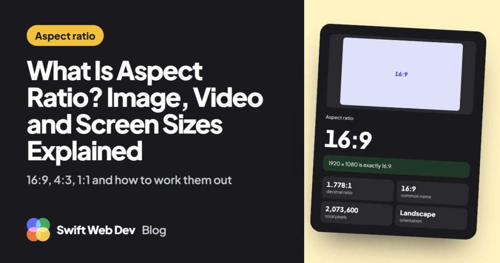
Aspect ratio is the width of an image, video or screen compared with its height. It’s written as two numbers with a colon between them, such as 16:9, which means 16 units wide for every 9 units high. It describes the shape, not the size, so a 1280 x 720 video and a 1920 x 1080 video are both 16:9.
I build WordPress sites, and mismatched image shapes are one of the most common reasons a page looks untidy or jumps around while it loads. This post explains what the numbers mean, how to work a ratio out by hand, and which ratios to use on a website. If you only need the answer, the aspect ratio calculator does the arithmetic for you.
What the aspect ratio numbers mean
The first number is always the width and the second is the height. The ratio has no units. It isn’t in pixels or inches. It only says how the two sides relate.
- Wider than tall (landscape): the first number is bigger, as in 16:9 or 4:3.
- Square: both numbers match, as in 1:1.
- Taller than wide (portrait): the first number is smaller, as in 9:16 or 4:5.
You’ll also see a ratio written as one decimal, which is the width divided by the height. 16:9 is 16 ÷ 9 = 1.778. A square is 1. Anything below 1 is a portrait shape.
How to calculate aspect ratio
Divide the width and the height by their greatest common divisor (GCD), the largest number that divides both exactly. What’s left is the ratio.
Take 1920 x 1080. The GCD of 1920 and 1080 is 120.
- 1920 ÷ 120 = 16.
- 1080 ÷ 120 = 9.
- The aspect ratio is 16:9.
To find the GCD by hand, keep dividing and carrying the remainder forward. 1920 ÷ 1080 leaves 840. 1080 ÷ 840 leaves 240. 840 ÷ 240 leaves 120. 240 ÷ 120 leaves nothing, so 120 is the answer.
Finding a missing height or width
When you know the ratio and one side, turn the formula around.
- Height = Width × Ratio height ÷ Ratio width
- Width = Height × Ratio width ÷ Ratio height
A 16:9 video that is 1280 pixels wide is 1280 × 9 ÷ 16 = 720 pixels high. A 4:3 image that is 800 pixels wide is 800 × 3 ÷ 4 = 600 pixels high. Going the other way, a 16:9 frame that is 1080 pixels high is 1080 × 16 ÷ 9 = 1920 pixels wide.
Not every width lands on a whole pixel. A 16:9 image 1000 pixels wide would be 562.5 pixels high, so you have to round and the shape is off by a hair. For an exact 16:9 size, pick a width that divides by 16. 1008 pixels wide gives exactly 567.
Why 1366 x 768 is only roughly 16:9
1366 x 768 is a common laptop screen, and it’s sold as 16:9. The GCD of 1366 and 768 is only 2, so the true ratio is 683:384. As a decimal that’s 1.779, against 1.778 for real 16:9. An exact 16:9 screen 1366 pixels wide would need to be 768.375 pixels high, which can’t exist. The gap is less than one pixel, so everyone treats it as 16:9. The aspect ratio calculator shows both the exact ratio and the nearest common one for cases like this.
Common aspect ratios and their sizes in pixels
Every size in a row has the same shape. Only the amount of detail changes.
| Ratio | Decimal | Typical sizes in pixels | Where it’s used |
|---|---|---|---|
| 16:9 | 1.778 | 1280 x 720, 1920 x 1080, 3840 x 2160 | TVs, monitors, online video |
| 16:10 | 1.6 | 1280 x 800, 1920 x 1200, 2560 x 1600 | Laptops |
| 4:3 | 1.333 | 1024 x 768, 1600 x 1200, 2048 x 1536 | Tablets, slides, older screens |
| 3:2 | 1.5 | 1080 x 720, 2160 x 1440, 3000 x 2000 | Camera photos |
| 1:1 | 1 | 1080 x 1080 | Square posts, profile pictures |
| 4:5 | 0.8 | 1080 x 1350 | Portrait social posts |
| 9:16 | 0.563 | 720 x 1280, 1080 x 1920 | Vertical phone video |
| 40:21 | 1.905 | 1200 x 630 | Social share images |
16:9 and 9:16 are the same shape turned on its side. 4:3 is squarer than 16:9: at the same height, a 16:9 picture is one third wider.
Aspect ratio vs resolution
They’re related but they aren’t the same thing. The aspect ratio is the shape. The resolution is the number of pixels, such as 1920 x 1080. You can get the ratio from the resolution, but not the other way around, because lots of resolutions share one ratio.
Aspect ratio on its own doesn’t change picture quality. Quality drops when a picture is shown in a shape it wasn’t made for. Then it gets stretched, cropped or shown with black bars at the sides or top and bottom.
Image aspect ratio on a website
This is where the ratio stops being trivia. Three habits fix most of the image problems I’m asked to sort out.
Keep one ratio across a set of cards
Blog grids, team photos and product cards look uneven when every image is a different shape. Worse, cards with different heights push the text below them out of line. Pick one ratio for each set, such as 16:9 or 3:2 for blog cards and 1:1 for team photos, and crop every image to it. The space for each image is then the same before a single file has loaded, which is what stops the layout from shifting.
Set width and height on every image
Add the width and height attributes to each image tag. The browser uses them to work out the aspect ratio and keeps that space free while the file downloads. Without them, the image arrives and shoves the content down the page. Google counts that movement in its Cumulative Layout Shift score, and its guide to optimizing layout shift lists images without dimensions as a common cause. WordPress adds both attributes to images placed from the media library. The ones I find missing are usually in hand-written HTML or custom template code.
Export at the right size before you upload
A photo straight from a phone or camera is far bigger than any page needs. Crop it to your chosen ratio and scale it down first. WordPress makes smaller copies of each upload. By default those are a 150 x 150 cropped thumbnail, a medium size up to 300 pixels and a large size up to 1024 pixels, and your theme can add its own.
That’s why there is no single WordPress featured image size. The theme decides. I usually export featured images at 1200 x 675, which is exactly 16:9, and keep the subject near the center in case a theme crops the edges. Once the size is right, run the file through the PNG to WebP converter to cut the file size without changing its width, height or shape. Logos are better kept as SVG, but when a platform won’t accept one, the SVG to PNG converter lets you set the width and works out the height so the artwork is never stretched.
The social share image: 1200 x 630
The picture that appears when someone shares your page on social media is set with an Open Graph image tag. 1200 x 630 pixels works well for it. That reduces to 40:21, often written as 1.91:1, which is a little wider than 16:9. A 16:9 image used here may lose a strip from the top and bottom, so keep text and faces away from the edges. The meta tag generator writes the Open Graph tags for you.
Aspect ratio in CSS
CSS has a property for this, so you don’t need padding tricks any more. One line fixes the shape of a box. A second line tells the image how to fill it.
.card img {
  width: 100%;
  aspect-ratio: 16 / 9;
  object-fit: cover;
}
The aspect-ratio: 16 / 9; line makes the height follow the width at every screen size. object-fit: cover; crops the picture to fill that box when its own shape is different, where the default would squash it. Use aspect-ratio: 1 / 1; for a square. MDN has the full reference for the aspect-ratio property.
This is a safety net, not a replacement for cropping. If the box is 16:9 and the upload is a portrait photo, cover will cut off most of it.
Questions people ask about aspect ratio
What aspect ratio is 1920×1080?
16:9. Divide both numbers by 120, their greatest common divisor, and you get 16 and 9. The same ratio covers 1280 x 720, 2560 x 1440 and 3840 x 2160.
Is aspect ratio the same as resolution?
No. Aspect ratio is the shape and resolution is the pixel count. A 1280 x 720 screen and a 3840 x 2160 screen have very different resolutions and the same 16:9 aspect ratio.
Does aspect ratio affect picture quality?
Not directly. A picture loses quality when it’s forced into a different shape and gets stretched, or when it has too few pixels for the size it’s shown at. Keep the ratio the same when you resize and nothing is distorted.
What aspect ratio is 3440×1440?
It reduces to 43:18, which is 2.389 as a decimal. Monitors at this size are sold as 21:9, but a true 21:9 is 2.333, so 3440 x 1440 is a little wider.
Does aspect ratio have units?
No. It’s a comparison of two lengths, so the units cancel out. 16:9 is the same shape whether you measure in pixels, inches or centimeters.
To check a size or find a missing width or height, use the free aspect ratio calculator, and see the rest of the website and WordPress tools for the image converters and the meta tag generator. If your site needs a custom calculator or a WordPress build where the images behave, start a discussion with Swift Web Dev.